 Official brand reference · 品牌指南
The PIAF brand, end to end.
One reference for everyone building PIAF Alignment Studio — the voice, the warm-tonal palette, the bilingual type system, the components, and a living product demo. Calm, grounded, sanctuary-like. Everything here is built from the real design system.
Calm
寧靜Spacious minimal. Whitespace is a feature; nothing shouts. The interface recedes so movement can lead.
Warm tonal
暖調Sand, linen, espresso. A single quiet terracotta accent, used sparingly. No cool tones, ever.
Bilingual
雙語English and Traditional Chinese sit side by side as equals — serif ZH for titles, sans for body.
Considered
考究Slow, unhurried motion. Soft corners and low, warm elevation. Every cue is deliberate.
A boutique alignment studio in North Point that sells a feeling — lightness, freedom — more than a workout.
Small classes of eight mats, considered cueing, a sanctuary rather than a gym. The brand name is always set PIAF in caps.
Voice & tone語氣
The brand sells lightness and freedom. Every word is calm, grounded and considered — a quiet host, never a coach shouting from the front of the room.
Calm, grounded, sensory. Sells a feeling, not a transformation. Sanctuary, not gym.
Second person, gentle imperative — and a quiet host. Speaks to the reader.
Display copy is sentence case (Canela); eyebrows, subtitles & buttons are UPPERCASE, wide tracking.
The brand name is PIAF — all caps in copy and display, but lowercase ‘piaf’ in technical identifiers (file, repo, package & skill names, URLs, CSS classes). Never mixed (not ‘Piaf’); the only exception is code identifiers the language forces to capitalise (React component names, the JS namespace).
Short, declarative. Often two beats joined by a period. Pull-quotes are first-person, italic.
EN & Traditional Chinese as equals. ZH serif for titles, sans for body.
Quiet and factual — “50 min”, “8 mats”, “2 spots left”, “HK$280”. No vanity stats.
Never. No exclamation stacking, no hype, no urgency.
On brand vs. off brand
The difference is the whole brand. Lead with feeling; stay quiet.
Quiet numbers
Factual, never vanity. The way PIAF states the small details.
Logo標誌
The identity is one interlocking P/A monogram built from two rounded squares with circular cuts — fine, geometric line-work. It appears as a monogram, a wordmark, and full lockups, in black and white only.
The monogram
The one true mark. Use it as the brand glyph, favicon, watermark, or a low-opacity empty-state fill over a warm tint. A scalable SVG master is the source of truth — prefer it over the PNGs wherever vector is supported.
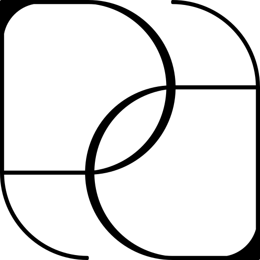 Vector master · SVG
 Monogram · on dark
Lockups & wordmarks
Balanced and compact lockups pair the monogram with the wordmark; the wordmark stands alone where space is tight. Always reproduce in a single brand colour — never recolour, stretch, or add effects.
 Balanced lockup
 Balanced · reversed
 Compact lockup
 Compact · reversed
 Wordmark · horizontal
 Wordmark · reversed
Usage
Give the mark room and keep it monochrome.
Color色彩
Three OKLCH families, each an 11-step ramp, feed one semantic layer that maps to both light and dark. Warm-only at the core: sand, greige and a single quiet terracotta. Functional and event palettes are quarantined into their own tiers.
Tier 1 · Core ramps
核心Warm-only. Backgrounds, surfaces and text all draw from Warm Spine; Stone keeps the UI from going monotone-brown; Clay is the one accent. ◆ marks anchors taken from brand photography.
Warm Spine
The backbone neutral. Backgrounds, surfaces AND text all draw from this one family — sand in the light half, espresso/near-black in the dark half.
Stone
Cooler greige neutral for borders, dividers and secondary surfaces — keeps the UI from going monotone-brown.
Clay
The single accent. Used sparingly. Hover LIFTS one step lighter (a warm glow) rather than darkening, so dark-text contrast holds.
Semantic tokens
語意One set of names, two mode mappings. Always use these in product UI — never the raw ramp stops — so light/dark and future retuning flow through automatically. Every text-on-surface pairing clears WCAG AA.
--background--surface--surface-raised--surface-sunken--text--text-subtle--text-muted--accent--accent-hover--accent-muted--accent-text--on-accent--border--border-strong--ring--background--surface--surface-raised--surface-sunken--text--text-subtle--text-muted--accent--accent-hover--accent-muted--accent-text--on-accent--border--border-strong--ringThe primary button uses dark espresso text on terracotta (--on-accent), clearing AA in both modes. Hover lifts the fill one step lighter — a warm glow, not a darken.
Tier 2 · Functional
功能Earthy, desaturated status cues — never decorative, never brand. Each is generated at the clay accent's lightness register, rotating hue only, so it still reads PIAF.
Tier 3 · Event & seasonal
活動An opt-in sub-palette for event collateral only — workshops, retreats, sound-healing posters. Never on core site chrome, nav or buttons.
Gradients
漸變A first-class surface treatment, not decoration — a gentle tonal shift across the warm spine, plus a faint clay wash for accent panels. Theme-reactive: these re-resolve in the mode you're viewing.
Type文字
Canela Deck (display serif) pairs with Montserrat (UI/body); Cormorant Garamond carries italic pull-quotes; Moglan is reserved for the logo only. Traditional Chinese uses Noto Serif HK for titles and Noto Sans HK for body — set as an equal, not an afterthought.
Families
字體The system runs two scripts as equals — Latin (English) and Traditional Chinese — each with its own display and body face. Moglan is ring-fenced for the logo alone, never for setting text.
--font-displayDisplay copy is Regular 400, sentence case. Bold uppercase for impact.
--font-sansAll interface text, labels, eyebrows and buttons.
--font-quoteItalic, member-voice quotes only.
--font-serif-zhTraditional Chinese headings, set as an equal to Canela.
--font-sans-zhChinese body, a touch larger for cleaner reading.
--font-quote-zhChinese member-voice pull-quotes — Noto Serif HK set italic (synthesised oblique) for now, mirroring Cormorant in Latin.
--font-logoReserved exclusively for the PIAF wordmark. Never set body, headings or UI in Moglan.
Type scale
級距Fluid where it matters (hero, display, quote). All sizes are tokens — never hardcode px.
--text-hero--text-display--text-quote--text-subhead--text-title--text-lg--text-base--text-sm--text-subtitle--text-eyebrowRole classes
角色Apply these directly, or read the underlying tokens. They encode the right family, weight, tracking and line-height for each job.
.piaf-hero.piaf-display-caps.piaf-title.piaf-subhead.piaf-quote.piaf-subtitle.piaf-eyebrow.piaf-body.piaf-title-zh.piaf-body-zh.piaf-quote-zhWeights & bilingual pairing
字重與雙語language of freedom.
Type in use
應用示例The role system working together in real layouts — recreated from the original PIAF typography reference (examples B1–B5).
Full-body conditioning. Strength, flexibility, control.
“I came for the Pilates. I stayed for how it made me feel.”
Slow, intentional stretching on the reformer to release tension and restore range of motion. Ideal after a long week.
Get the fonts
字型下載Self-hosted brand faces are downloadable here; the supporting families load from Google Fonts — follow the link to their specimen pages. Need everything at once? Grab the bundle.
Display serif · Commercial (Commercial Type) — self-hosted webfont
100100 italic300300 italic400400 italic500500 italic700700 italic900900 italicLoaded from the Google Fonts CDN — open the specimen to download or self-host.
Space間距
Airy by default. A 4px base, sections breathing at 96–128px, text columns capped around 66ch, and a 1200px max container. Whitespace is a feature, not a gap to fill.
Spacing scale
間距4px base. Use the token, not a magic number.
--space-14px--space-28px--space-312px--space-416px--space-524px--space-632px--space-748px--space-864px--space-996px--space-10128pxRadii
圓角Soft, generous corners — never pill-everything. 14px cards, 22px sheets, pill chips & avatars.
--radius-xs--radius-sm--radius-md--radius-lg--radius-xl--radius-fullLayout maxima
版面Container and readable measure.
--containerMax content width, centred.
--measureReadable text column cap.
Grid & layout網格WIP · 進行中
How PIAF arranges a page: a 12-column grid inside the 1200px container, generous gutters from the 4px scale, and text columns capped at 66ch. The container and measure are settled; the column counts and breakpoints below are proposed and still being tuned.
12-column grid
網格The base lattice. Most layouts use simple spans — a wide block beside a narrow one, even halves, or equal card rows.
Container & measure
版面These two ARE defined — carry over from Space.
--containerMax content width, centred, 40px page gutter.
--measureReadable text column cap — never run prose full-width.
Breakpoints
斷點Proposed — not yet tokenised. The column count steps up as the viewport widens.
| Token | Min width | Device | Columns |
|---|---|---|---|
| sm | 640px | phone | 4 columns |
| md | 768px | tablet | 8 columns |
| lg | 1024px | laptop | 12 columns |
| xl | 1280px | desktop | 12 cols · 1200 max |
Motion & depth動態
Elevation is warm and low — espresso-tinted, diffuse shadows, never grey or harsh. Motion is sanctuary-calm: gentle ease-out, no bounce, no overshoot, and it honours reduced-motion.
Elevation
層次Warm, low, diffuse. Cards rest on a raised warm-white (espresso in dark) surface with a 1px stone border.
--shadow-xs--shadow-sm--shadow-md--shadow-lgDuration & easing
時間Three durations, one calm ease-out. Hover the cards — slow and unhurried.
--dur-fast--dur-base--dur-slowEasing is --ease-out: cubic-bezier(.22,.61,.36,1). Press = subtle scale(0.97). All durations collapse to 0ms under prefers-reduced-motion.
Icons圖示
PIAF's identity is typographic and photographic, not icon-heavy. There is no proprietary icon set — the one true mark is the monogram. Keep icons sparse; let type and space do the work.
The interlocking P/A monogram — fine geometric line-work. Favicon, watermark, low-opacity empty-state fill.
When UI genuinely needs them, use a thin, rounded-stroke set (1.5px, rounded caps) to match the monogram — Lucide is the recommended match.
Used sparingly for tiny cues. No decorative emoji, ever.
Imagery影像
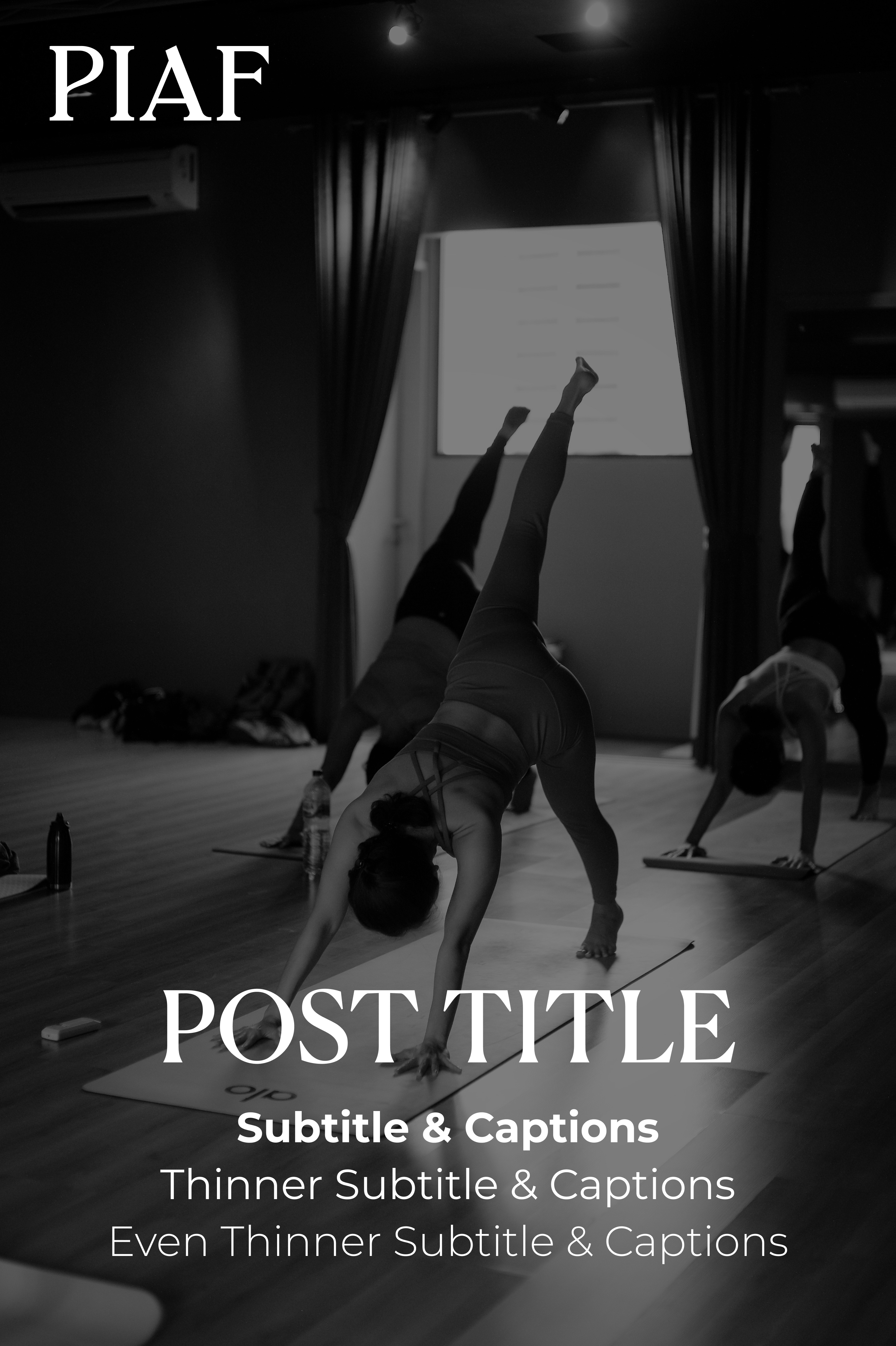
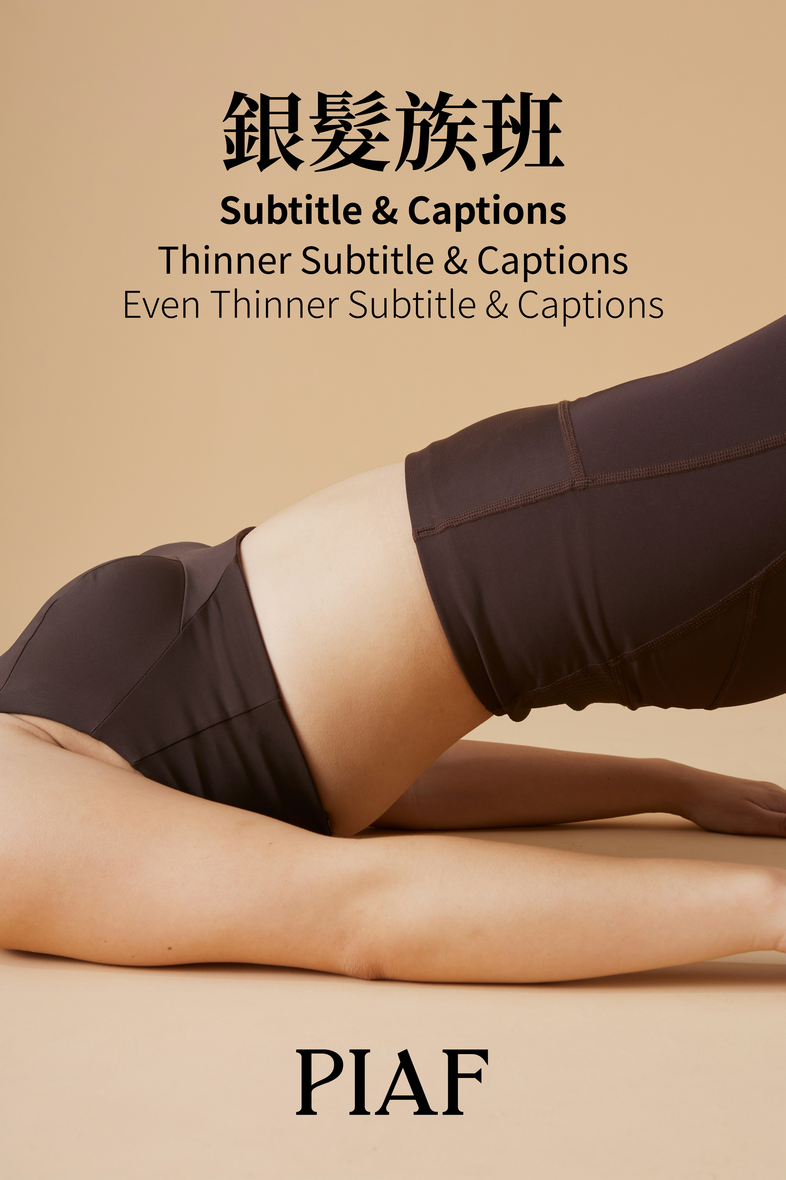
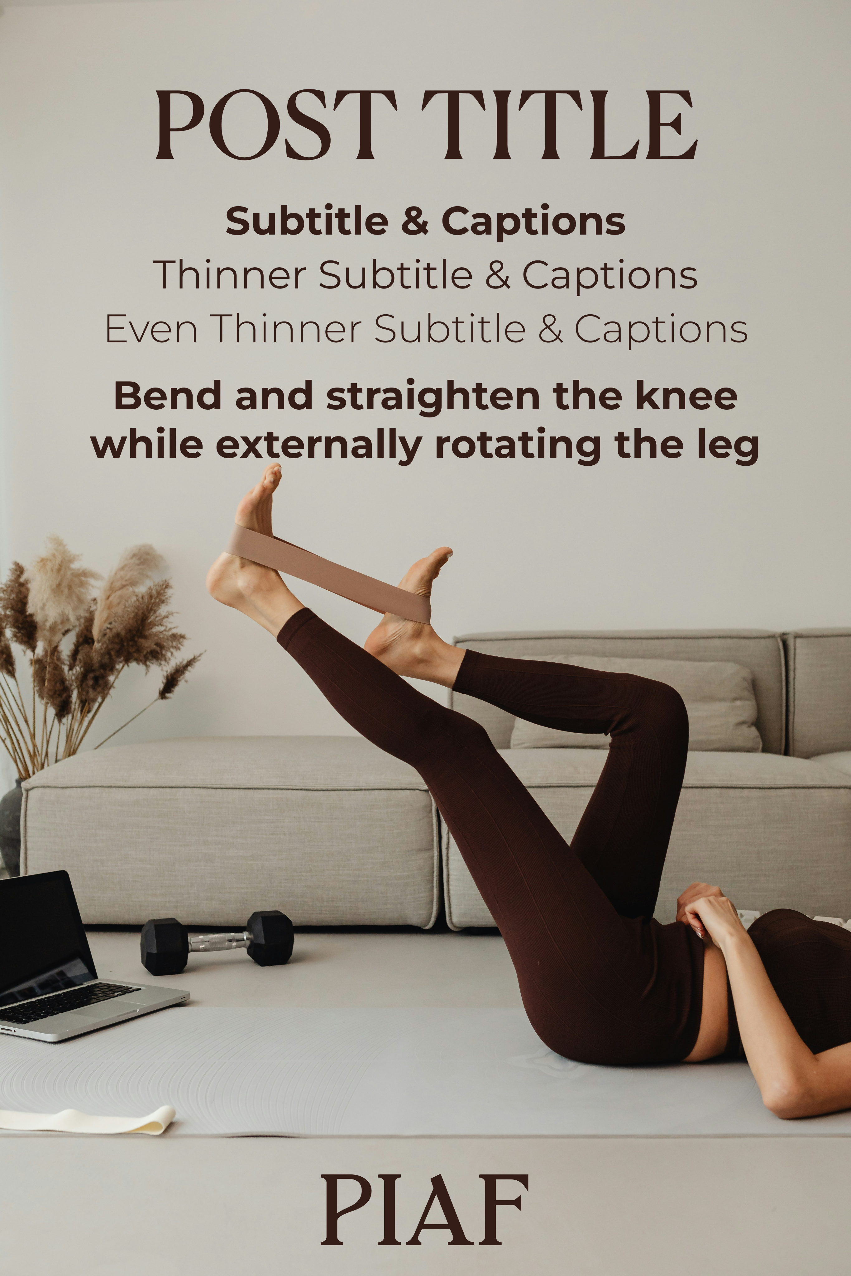
Warm-tonal photography — sand and linen backdrops, espresso activewear, soft natural light, with the occasional B&W studio shot for drama. No cool tones, no harsh flash, no stock-gym energy.
Treatment
處理How imagery carries text.
Components元件
Six React primitives, styled entirely through semantic tokens — so every one of them flips with the theme toggle above. These are the live components from the design system, not screenshots.
Button
按鈕Quiet terracotta fill with deep-brown text (AA in both modes). Use primary once per view; secondary and ghost support it.
Tag
標籤Pill chip for class metadata — uppercase micro-label.
Card
卡片Calm surface container with soft 22px corners, warm low elevation, and an optional media header (image URL or node).
Input
輸入Labelled field with optional bilingual label and helper / error states.
Switch
開關Calm toggle — terracotta when on, stone track when off.
Avatar
頭像Instructor / member portrait with a Canela monogram initials fallback.
UI kit in use實例
The PIAF booking site, built entirely from this system — the same components, tokens and type you've just seen. Book a class to see the calm slide-in drawer; flip the preview independently of the page, or open the full site.

Booking drawer exercises Input, Switch, Tag & Button; the page uses Card & Avatar — all six core components, live.
Applications應用WIP · 進行中
The brand beyond the screen — collateral built from the very same tokens, type roles and the P/A monogram. A few worked examples; more on the way. (Print pieces use fixed ramp stops since paper has no dark mode; on-screen pieces use semantic tokens.)
Business card
名片Monogram-forward front; quiet, typographic back.
Social
社交Square posts — a warm gradient, or full-bleed photography under the espresso scrim.
Email signature
電郵簽署On-screen — uses semantic tokens, so it sits happily in light or dark mail clients.
North Point, Hong Kong 香港北角